Friday, 25 April 2008

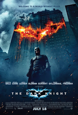
The Dark Knight


The whole marketing campaign behind this summer's sure fire hit has been more than just a joke. With mock elections and www.whysoserious.com having images added everyday of jokers all around the world. The latest international poster is yet another example of quality graphic design. Batman has never been more grounded.

Visit the site above or click on the image for a full size version.
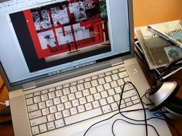
The Design Observer Playlist


'I’ve never worked in a design studio where music wasn’t played pretty much constantly. Nor can I recall visiting a studio where music wasn’t being played, or where designers weren’t wired up to headphones and bobbing rhythmically to unheard sounds. What is it with graphic designers and music? Is there a symbiotic relationship between the two? Are there studios where music is considered a hindrance? Or does music aid creative thinking and make us better designers?'

Read the rest of the articles here - www.designobserver.com/archives/035704.html#more

Illustrators Lounge


Wonderful site showcasing the collectives' talents.